There always seem to be two streams of drawings on the go: those which are involved in competitions (which these days mean that younger colleagues are processing things digitally and I am feeding sketches or edit-overlays—since the technique my real drawings will be considered too archaic to impress the pundits in the East or Middle-East). The others are the “Dream-Drawings”—or unsolicited projects that roll on in the way of “conversations with myself.”
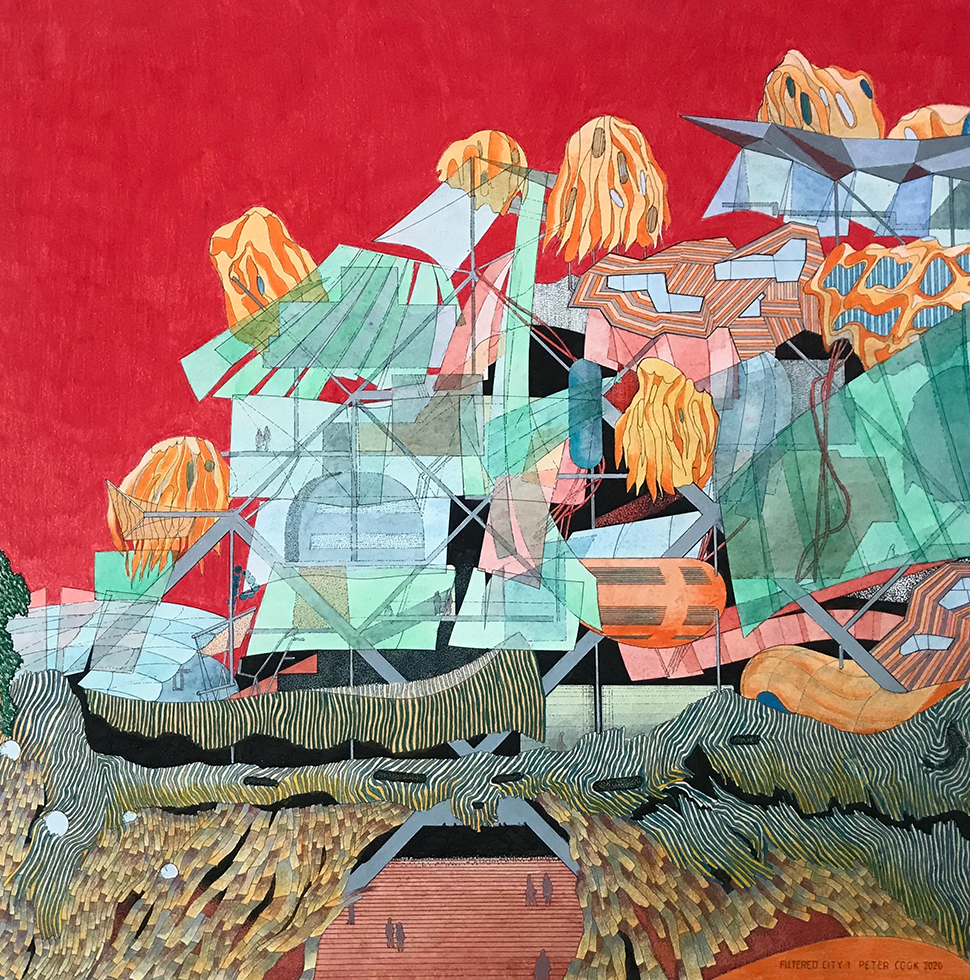
Illustrated here are two sets of such conversations. In earlier projects starting with the “Arcadia” series of the 1970s and flowing past the Frankfurt “Real City,” the Berlin “Way Out West,” right through to 2018 with the love-hate incursion into the world of the Tuscan hilltop town, I have tended to find sustenance and comfort in European lowlands or gentle hillsides: whether from East Anglia, Hesse or Prussia, to imagined amalgams of all these. Yet in some ways, the “Filtered City” is abstracted: as were the early megastructures. The adoption of red for the sky is a borrowing (also used earlier for a Tel Aviv Tower suggestion) from a very haunting drawing made by my former teacher, Peter Smithson, when he was making a competition project at the Royal Academy. Red dramatizes and somehow detaches a proposition from over-realism.
Indeed, it is both a defense of my laziness in not becoming computer literate but also a critique of commercial computer renderings (that even the most original and imaginative architects seem to have to subscribe to…) that they are so keen to make the handrails glisten, the inhabitants blandly happy, the sky blue, the materials crunchy… It gets on your nerves… it’s all so politically correct somehow. If I make a surface orange it may be an act of defiance, or cussedness, or the wish to draw your attention to it. (In a newly completed building in Bournemouth, I make waves of orange and yellow and red partly to wake up the tweedy, pleased-with-themselves inhabitants of a suburb that has suddenly had to notice the existence of 3000 “creatives” across the street). Added to which, I can change my mind 11/15ths of the way along a line—if I wish.
Yet, all the time, the last thirty years—since I started making a few buildings—has provided a steady flow of cause-and-effect experiences that find their way back from reality to the hypothetical. The exuberance of color (as in Vienna), the power of electrics (as in Graz), the blueness of total blue outside and the whiteness of total white inside (as in Bournemouth) and—more subtly—the issue of the “presence of the object” (Bond, Queensland). In this last, there are several occasions in which an element is rarely seen full-on, partially glimpsed, emerging from a corner, declaring itself through shadow rather than full surface. Filtering, layering, dangling meshes, and decoys have cropped up right from the days of the “Via Appia House” of 1977 (with Christine Hawley).


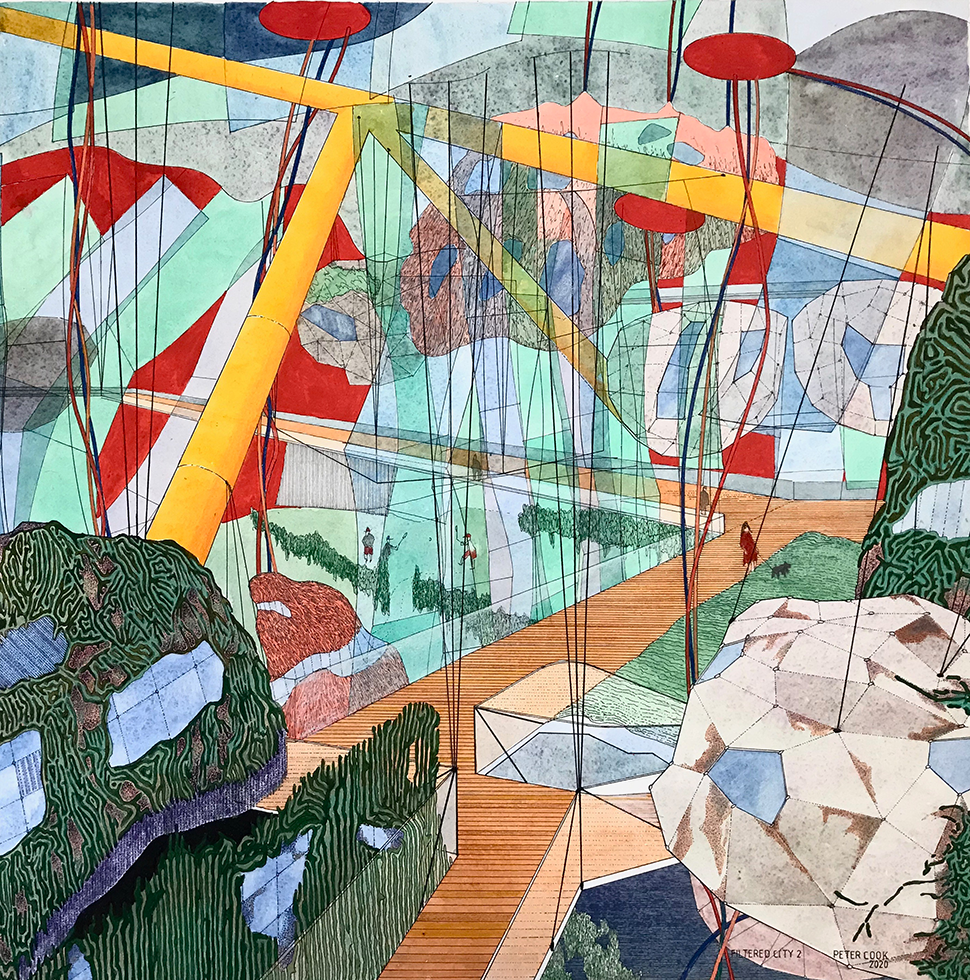
Hence the reiterated urge to explore the implications of hanging veils or filters among, and even as part of, a faintly megastructural collection of pods and trays and flimsy enclosures. From Bucky Fuller’s New York dome onwards, one has taken as an “optional a priori” the notion that a series of built objects can huddle under some portmanteau shelter—and then proceed to go inside it with the project in hand.
So it is with these two drawings: the first exploring the cabins or “pods” and their existence at the edges and the second more interested in the “trays” and the suggestion that a pod is very much a transitory element—subject to replacement and even able to distort.
The weavy snake-like, leaf-like surface of the pods stems from various drawings of the last four or five years where I am inspired to steal from friends such as Marcos Cruz and Marjon Colletti or Claudia Pasquero and Marco Poletto who can—between them—graphically and physically grow vegetal conditions. So, with pen in hand, I virtually cartoon these conditions to support my own proposition.
I somehow cannot abandon bright color—indeed I get gloomy using dour tones and bored just making suggestions in black and white (yes, I admire Bach but can wallow in Bruckner).
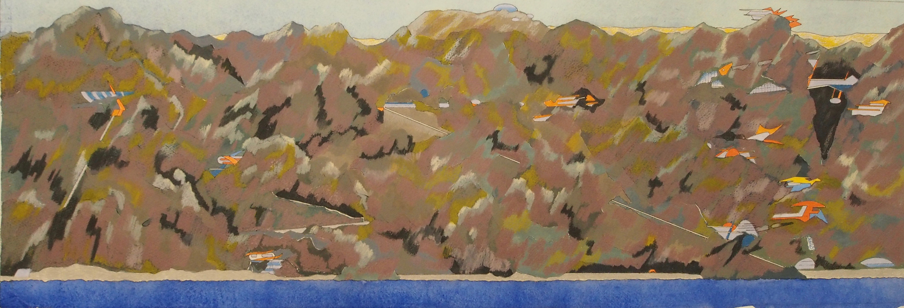
The other two drawings are off in another, newer direction. The narrow one—the elevation of a village clinging onto a cliff-like mountain—started off as a competition element and then took off on its own. The location is alien to me as a northern valley-dweller. Its hostility nonetheless calls forth quite aggressive forms to the dwellings and the use of sharp, blade-like routes cutting through.
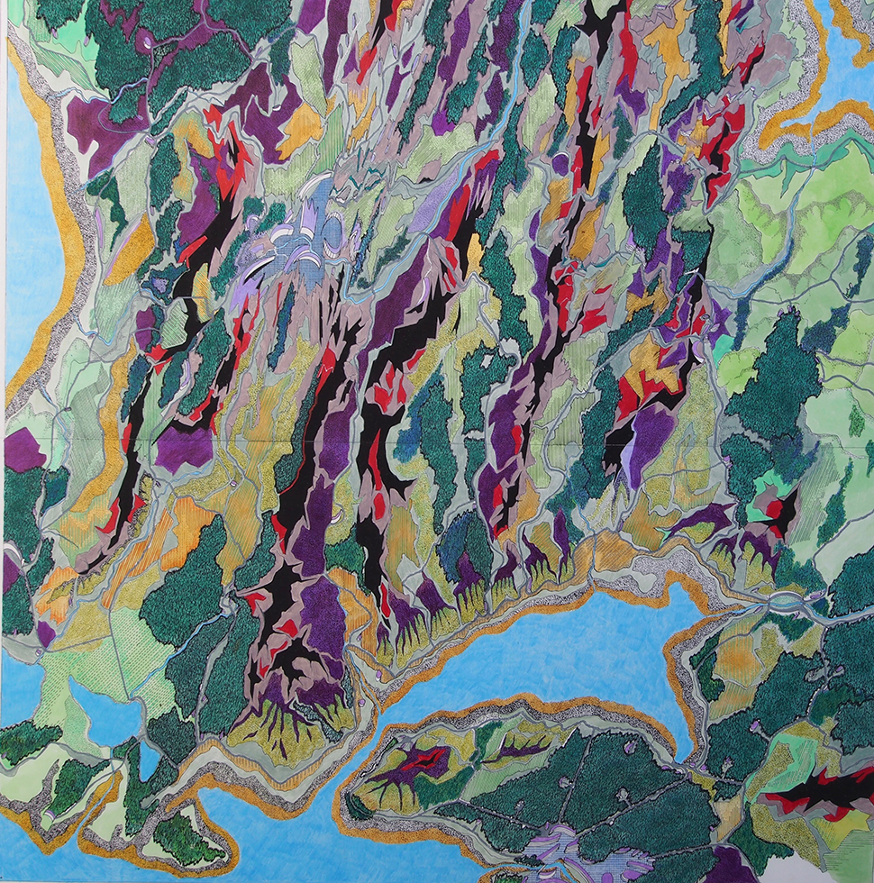
In turn, it prompted the larger, square drawing: entitled “Tough Landscape—Friendly Forests.” To some extent it is a follow-on from a big drawing of seven years ago entitled “Hidden City” which explored the ambiguity of (a) “natural” formations and vegetation as paralleled by (b) “tectonic” or (c) maybe tectonic elements. The trick was to constantly pose or fold these three categories around each other. Drawn in Oslo, with a glimpse of the Fjord and a full-frontal view of many trees, it acted as a self-puzzler.
The new drawing is more prepared to distinguish between the aggressive and the benign: it is a condensed landscape that quickly moves from tough rocks to meadows, from escarpments to marshes, and marks roads unambiguously as roads. In some ways, it is more cartographic than “Hidden City” and has echoes of my childhood game of inventing my own towns and countryside in imitation of the old “one inch to one mile” Ordnance Survey maps. In this drawing there are two small towns depicted as well as occasional scattered settlements. These towns are rather more tightly formed than in the English tradition, the architecture white and scimitar-like, the ground machined. An implantation of the urban rather than benign settlement. As with the cliff-village, there is a degree of aggression—or is it fear of the mountains?


Yet my next drawing will hone in on a sub-plot—that of the “Friendly Forests.” For you may notice the little dwellings that often poke out of the corners of the woodland. Are we not in gentle Suffolk, England, where the lodge houses nestle against the trees? Further down towards the bottom of the drawing too, another remembered conversation—concerning the mandate of the European elite to play with forests: the memory of Karlsruhe perhaps.
Peter Cook is an architect, lecturer, and writer. He was a founding member of Archigram in the early 1960s.